I have been doing a lot of searches online about relationship mapping and prospect research. So far I could not find anything more than high-level concepts. Also, most data visualizations are mapping out too big a constituency for us to make any sense out of. They are more applicable to Social Network Analysis (SNA) or analysis of group behaviors and patterns. Not that these aren’t important for us as we will see later that the basics of SNA could be very useful for prospect research as well, but I would like to suggest to start small with the visualization of individual relationship map and see what we can get out of it.
First, it is important to have a process to identify relationships, define them, and update them periodically. My first step is to create an individual relationship map by finding all the direct connections of a prospect. For example, John Smith works for ABC companies. We define the relationship between John and other executives who work for ABC company as a “Colleague” relationship. John Smith is also a board member of EFG Corporation. Hence John has a “Board” relationship with everyone on the board of EFG Corporation and so on. We make these connections in an Edge list (as follows) with the organization as an intermediary (showing how they are connected) except for direction relationships like family or friends. Then, we define these relationships as “Groups” in NodeXL like the following for John Smith’s individual relationship map:
Edge List
Vertex1 Vertex2
John ABC Company
Jim ABC Company
John EFG Corporation
Carl EFG Corporation
John Kara (wife hence connection is direct, no organization as an intermediary)
John ABC Company
Jim ABC Company
John EFG Corporation
Carl EFG Corporation
John Kara (wife hence connection is direct, no organization as an intermediary)
Grouping
Group Name Group Vertex
Board Carl
Colleague Jim
Family Kara
Board Carl
Colleague Jim
Family Kara
By assigning different colors or shapes to these groups of individuals (organizations will stay unchanged as an intermediary), we can now demonstrate meaningful relationships visually for John Smith’s circle of connections. In Figure 1, we did an individual relationship for a campaign volunteer and defined the individuals with the following relationships: Board (Green), Business/Colleague (Red), Family/Friend (Blue), and Club (Purple).
Second, it is important to screen each individual connection in relationship to the institution and identify mainly those who are close to the organization like alumni, volunteers, or major donors (hence will have a direct edge connected to the institution) and those who we want to get to know (prospects). Our institution has an affinity scoring scheme that we apply to each connection. We can plot this relationship map with assigning different color or shape to scores which is not only useful to individual relationship visualization, but also could be used in the whole constituency database visualization. For example, for this volunteer’s individual map, we have identified two prospects (labeled) and we are able to identify multiple path of these prospects in relationship to the institution hence come up with a strategy that’s the most effective in approaching them.
Figure 1
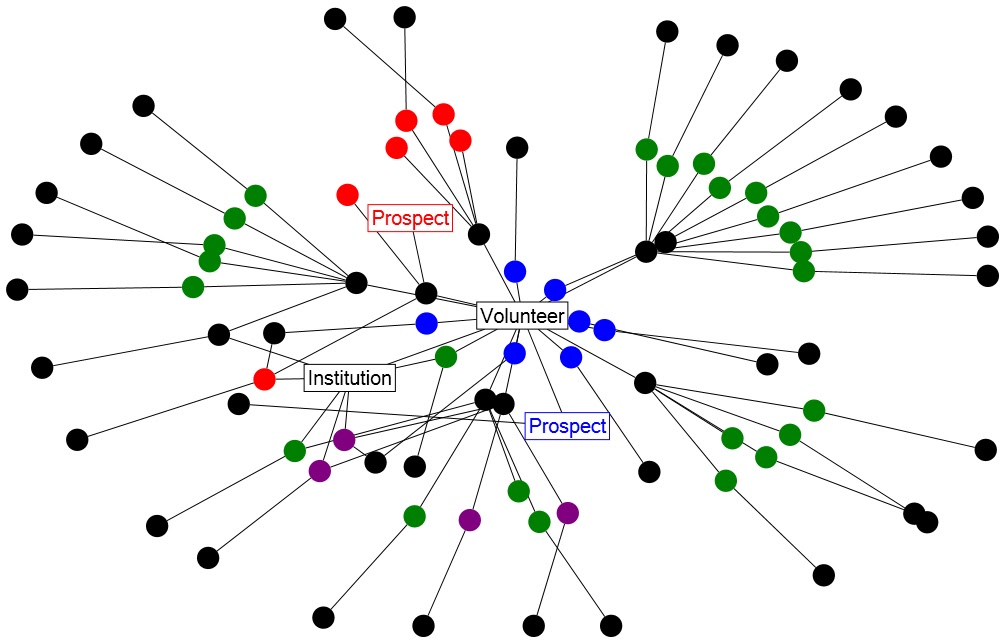
At this point, I think the visualization is already becoming much more informative than a spreadsheet or word document of who are connected, how they are connected as well as their relationships to the institution. The exercise of finding connections and screening connections also provided me with an incredible amount of new quality leads that we wouldn’t be able to discover otherwise. We are especially happy with leads who are our alumni and connected to our campaign volunteer or potential prospects.
What’s more important, as I mentioned before, is extracting from a bigger constituency which I will explore in future posts.
No comments:
Post a Comment